Location, Location
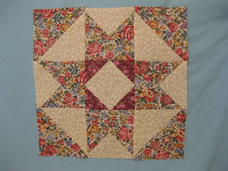
 Oh my, what a difference fabric placement makes. I am much happier with this August block!
It does not appear as heavy as my first attempt and is much more appealing to the eye.
 Lesson learned: location, location, location is not just a concept for real estate.
 Which fabric placement do you prefer?
I do like this better...
ReplyDeleteI like the second block better, but the first is pretty too!
ReplyDeleteI love the first one b/c it shows more color, but I love the pattern of the 2nd one better!! Not sure if that helps you!! lol
ReplyDelete(By the way, thanks for the liquid o2 info you posted on my blog! I have called them, and they are going to set up something soon to come here and explain everything about it. Then I can decide whether or not I'd like to try it, and if I want to, they'll switch everything then and there! I'll be keeping everyone posted! :))
Oh, now I really like this block! So much better than the first sample!! Well done!
ReplyDeleteOn it's own, I like the lighter version, but ya know, putting them next to one another is really cool, especially if you lighten up the dark one just a tad! This could be the start of something BIG!
ReplyDeleteOh yeah! the second one does a great job of color and design both. Nice job. (And, no blue...eh?)
ReplyDeleteI agree.
ReplyDeleteHello,
ReplyDeleteI like more your last version.
Thanks for share all those beautiful rugs, great job.
I don't think the first one is bad, but the second one is more pleasing to look at--better contrast between fabrics.
ReplyDeleteI, like you, prefer the second one...shows the different colors and shapes more clearly.
ReplyDeleteI like the right hand side placement.
ReplyDeleteA traditonal star is easy on my eyes and mind.
I am happiest with simple right now !
and familiar.
the star is familiar to me and so lovely
I prefer the second... but then me & red...dont go together! LOL.
ReplyDelete